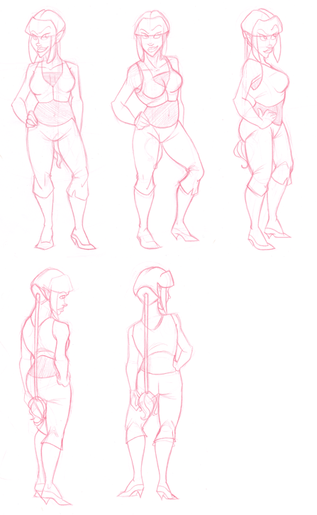
 SECOND character rotation attempt for my animation portfolio. I really can't win, I've started to realize this. I am much happier with this version than the first, because it has all the attitude that I originally wanted in my rotation (before I went with something simple and static) as well as? CURVES.
What is Tina without curves?
An angry skinny chick.
You can check out my much much larger rotation here.
I took DQ's advice to heart and I started from scratch all over again. During the entire process of this piece, all I had going through my head was *sproing* *sproing* *sproing* and the visualization of a giant spring working up and down throughout the entire body.
I discarded two other poses while I was working, because they weren't consistent enough to suit my purposes.
You can take a look at my older, unsuccessful rotation here. You'll notice lovely lovely Tinette has gained some weight, but in all the right ways. She's also gotten taller from my last rotation, which will make my friend Leah happy.
So the BIGGEST inconsistencies I see are during the switch from profile to 3/4 back view, Tinette's eyes drop, as does her nose. She's suddenly looking a bit further down than she was previously, only to be recovered in the next rotation. SO I NEED TO FIX THAT. Another inconsistency I noticed, and noticed while I was working, is that while in her front and 3/4 rotation, her second finger is along the hem of her pants. However, in the profile rotation... Her hand is further up on her hip than previous. The thing is, I'm not totally sure how to fix that, as the hem is consistent from one jump to the other, so is the hand. They just.. don't line up consistently, and I don't know what to do about it.
So that's another thing I need to work on!
I was also doing a lot of staring at the foot placement. As the rotation moves from pose to pose, the feet don't stay rooted in the same position, which would occur naturally, right?
I hope so. It looks natural, and it feels right, but at the same time I'm like.. IS that right? I hope so.
Tomorrow after school I'm going to return to DQs office and wait for him like I did last week. Hopefully he won't mind taking another look, as he invited me to ask him if I had any questions, and I'd like to show him I took his advice to heart and made (impressive) changes to (so far) the character portion of my portfolio. I still plan to take the rest of the advice he gave me to heart as well, and still have a lot of work to do in less than two weeks.
Oh Lord, please lend me strength. Or I will keel over and die.
*panic*
~Annie
11:26

Looking really, really good. The only jump I see in the rotation is from back to front..
ReplyDeleteIt looks MUCH more realistic then the first rotation. You've definatly done a great job!
*clp**clap* yay! this is looking good there are some mistakes that you mentioned but all is good its good your going to DQ (tee hee his name reminds me of dairy queen) for help
ReplyDeleteI really like this. I like the fact you put some weight on her. It makes your art seem quite realistic. I mean not every girl is a toothpick! lady has to have something to back up that badass look.
ReplyDelete