Showing posts with label painting. Show all posts

Tuesday, April 2, 2013

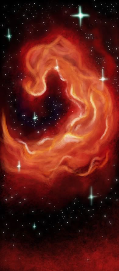
The Five Ghosts

I haven't posted in a while. Been throwing together really quick doodles and posting them over on my tumblr, because I haven't had time to work on anything in a long time.

I was walking to school and listening to music, totally lost in thought, thinking about this one artist I'm a big fan of, and something she said about Nancy Drew covers, and how she wanted to make one of her own, and as I was walking, so did I.

My cover wound up being entirely inspired by the song I was listening to at the time, so here's The Five Ghosts, inspired by the song of the same name by Stars.

It was really fun to just paint something. I tried some new things I haven't before, since I'm a disaster in the composition department, but I tried to follow some basic rules that I've picked up through college.

Yah, that was fun, glad I took the time to do that even though I don't have any time right now to be fooling around.

Annie

8:05

Saturday, November 17, 2012

Finished

Yay!

I've been working on this since Wednesday, I think. That's when I drew the original sketch at least.

I'm pretty proud of this. It's not often I go all gung ho on a painting, since I usually get bored about halfway through, but this one demanded my attention until I finished. Now I have.

Sweet.

This is Ninja, shortly after she unlocks her locked powers and her eyes changed from brown to red.  Ninja can use other magic too, but fire is her natural gift and requires no casting to access.

She can't control it very well, so she avoids using it, though it can get away from her when she gets too angry.

Yay Ninja!

Yay painting!!

 To the right is the original sketch I painted over.

I am exhausted.

Annie

11:29

Friday, November 16, 2012

Another Update

Aaaand I've slapped in some colours. Now I have to actually paint it.

Yaaay.

Annie

2:17

Thursday, November 15, 2012

Hacking Away

I've been working at this all evening.

Remember how I said that I didn't have any time to work anymore? So I drew this earlier during story class and while discussing different directions to take our film in-

I came home and I started to paint it, because I liked it very much, and I had a lot of inspiration. I wanted to paint it the way I'd learned while away at my workshop, so... lots and lots of rendering! I've been painting since five thirty.

I didn't know how to paint fire, so I looked up a reference and painted from that.

Hooraaaay, a painting!

This is Ninja, also. She's cool like that. Burns things to cinders. Because she's amazing.

I hope to add colour maybe tomorrow or something?

Annie

12:47

Sunday, May 20, 2012

Just Some Paint

Playin' with the mixer brush in photoshop. I have no idea what I'm doing.

Still sick, too fuzzy feeling to actually write a blog.

Annie

2:52

Friday, February 11, 2011

Step Away from the Curtains

Man, I hate painting curtains. I don't know why I keep doing this to myself, but it's always near curtains.

I finished painting Tina on my CRT and I uploaded her to deviantart- and it was at that point I realized Tinette was horrifically purple. The colours aren't as painful on my CRT, which is matched up to whatever comes out of my printer, so that's alright, I guess, but I was hoping to make some sort of happy balance; too bad I didn't save the PSD at a point where I'd painted the background.

None the less, I had a lot of fun drawing this.

I realized Kara and Tina are off by one inch and five pounds; so I guess in essence, they're the same BMI.

Actually, I just ran a calculation and they have the EXACT SAME BMI. Oops. Tinette just gets more in her boobs and hips, while Kara's a little more evenly balanced. I imagine Tinette is heavier than I give her credit for; she's probably pushing the realm of 180 or 190; she is a dancer after all, they have some wicked toning going on to add to all them hippage.


I had a real run at the colours- I couldn't decide which to use. I personally find Tinette suits red better- but the green colour scheme appealed to me in the first place (hence why there are so many versions of it) and it seemed that everyone I showed it to love the green- though Leah said red was a sexy colour, but wasn't digging the purple.

Ah well, I was trying to steer clear of the reds because this wasn't an outfit Tinette chose for herself; it just so happened that Garrett magically changed her outfit without her realizing it. I tried pastels first, to try the whole fae colour scheme of soft and gentle looking- but nothing suits Tinette worse than pastels. Gross.

Here she is! With her glass of fine wine and a lovely outfit and apparently floating in mid air because I didn't bother to draw her back leg. Tinette will snap your fingers. Or ignore you. Depending on what you do to provoke her.

I've been working on her race in the back of my head, even though I won't be delving into it at all in my story. I've decided demons are a very cultural race; everything follows strict rules and traditional ceremony. There are cultural greetings specific to who they are, and there are stories and folklore that they build their lives out of. Tinette is of the younger generation who reject this- but that's mostly because she got betrayed and shot and hates everything about her people. She still pays her respects to the god and the goddess- but in a very casual way.

11:45

Annie

Tuesday, February 8, 2011

Leafy Leaf Leafs!!

Oh look, it's Kara!

And oh lookit how pretty she is!

Durhur.

I don't know what I want to say.

Again, Kara's like.. my standout to the fact that I think a girl doesn't have to be stick thin to be beautiful. Instead to be proud and confident in who you are!

Kara Naidu
21
5'6"
165lbs
Kara's kindhearted to a fault; she's incredibly loyal and head over heels in love with Ainmire.

This is for a series of GoM profile images. Hooray!!

And I thought about it. I considered it. And no, she doesn't look pregnant.

8:35

Annie

Saturday, January 29, 2011

Hi Mom

This is the rough line art for my proportion/scale assignment for layout class.

It's mostly for my own pleasure though.

It's Sherry and his mother! Isn't she a charmer?

I was thinking about the story behind this for a while, and it was fun because I had to run back to the storyline I'd given up on for him, very heavily based in Greek Mythology.

Sherlock used to be named Nikodemus, but when I realized he was the baby I'd always wanted to create and name after Sherlock Holmes, I switched Nikodemus to his middle name and named him after Sherlock. He's very dear to me.

Sherry's father was a human, while his mother was a gorgon. I'm going to take liberties and say his mother can change her physical appearance, else the biology would have never worked. Anyways, Sherry, was, along with his siblings, hatched, as snakes are. Having taken very much after his father in shape, his sisters drove him from the nest, and Sherry was introduced into the world.

Just by being born part god (liberties. I take them.), he was taking part in a tournament that had been carrying on for years- and the winner was granted permission to return to olympus. Despite being ashamed of his ability to turn people to stone, Sherlock thought if he could win, he could return home to his mother and his sisters.

Unfortunately, being well, Sherlock, he was quickly beaten down, and if it wasn't for Ainmire he wouldn't have survived. Though he probably would have stayed with Kara, for this assignment I toyed with the idea that he tried to return home anyways.

He wasn't greeted favourably. Sadface.

Ignore the plot hole that both of these guys would have turned each other to stone the second they made eye contact, hm?

Although that's another interesting illustration I could follow up with...

This is my newest painting for painting class.

Gotta say, I really hate gouache-- but this stuff wasn't too bad. It worked almost like water colour and I wasn't just shoving colours around and picking up under colours and creating mud, which is nice.

I've been requested to attend extra painting classes on Mondays- which is a huge bummer, but I'm honestly scared of what will happen if I don't go. My teacher thinks I'm a bit thick in the head, on top of talentless. Don't worry, I got rid of that distracting white square in the back there.

I'm pretty happy with this painting, I got the gloomy look I was looking for. I left out a lot of wires and busy stuff from my first design including all the smog and dirt I was going to sponge in. I look at this and I don't think "What a piece of s#*t", I think, "Huh, that kinda looks like where I think Rebel raised Ninja. No, I'm not an amazing painter, but I still like it.

That makes me happy!

Annie

10:02

Monday, January 10, 2011

TRONified

My latest bit of inspiration.

Disney should TOTALLY drop all their things and hire me as a layout painter.

Suffice to say I love TRON Legacy way more than is healthy.

Big fan of the new light suit designs, they seem so much more believable and real than the original ones. Probably because this time around all the costumes actually lit up; instead of having the lights digitally added like they were for the first film.

I got this idea while listening to the Daft Punk soundtrack for the new movie. Rebel was just made for the grid, I didn't have a problem designing him at all, haha. He's fun to draw. And he's developed a bit of a nasty streak since I've started to RP with him.

Rebels design was based off every character I've seen on the grid; no cotton, just supah spandex. Played with the lines some to make it stand out; black lines on a black character equal disaster.

Ninja's design was a little more difficult, because I didn't see her on the grid. She's too young to partake in the games, but I picture her being a bloody nightmare off the grid anyways. I based her colours mostly off Jem and Castor, Castor being the biggest influence. All the white was a little more difficult to light up- but I think I did okay by changing the colour of my lines.

I've GOT to get myself a copy of 'Betrayal'.

Also, so long as I'm on my TRON funk, I introduce:

TRON Sherlock; Helmet free.

Yes, I freaking love the new light suit designs. There's so much room for customization, I can have so much fun!

This drawing was a huge mess, haha, I had limbs all over the place and no idea what I was trying to do. His face is still all wrong, haha, but oh well, here's skinny skinny Sherry, and his light disk.

I picture him with more of a green blue, I think. Probably partaking in the disc battles. Poor guy, I don't think he'd last very long. This is obviously not half-gorgon Sherlock, just Sherlock, a regular, perfectly normal kid.

What bit of TRON fanart would be complete without my addition of Tinette? None, that's how many. I picture her in red, and probably previously part of the Black Guard who operates on her own agenda. Tinette doesn't take well to order and hates being told what to do.

This one was a lot of fun to draw, ah ha! I based her hair off the muses from the new movie- and the visor was one of my own design, mostly inspired by Jarvis. Hooks around the back of the head and sits just about the ears while the visor protects the eyes. Her hair looks much shorter, only because it's half tied up.

I also drew Ainmire, and he had a TRONified cape, but I wasn't happy with the final picture, so I'll have to try again.

Hooray TRON!

5:53

Annie

Saturday, November 27, 2010

No More Noise!

It was on my list of things to do, revamp the last picture I made. I wanted to paint a new spacey background, but unfortunately I'm pressed for time, so I took the last one, upped the contrast and put it in.

I then had to put an outer glow around Tinette because otherwise you lost a lot of her outfit against the blue in the ... I guess I can't really call space a sky, can I? Oh well.

Revamped! She looks less retarded than the old one, and her body shape is a little more accurate. I'm starting to realize Tinette's boobs aren't as massive as I always joked, but her hips certainly are. She's a gorgeous hippy babe! Haha.

Didn't make the effort to have her hair twisting out to be in view because you know what, by now everyone knows Tinette has a braid that goes down to her knees. Almost her knees, just above her knees, really.

She looks much more Captainy here.

Annie

1:38

Friday, November 26, 2010

A Small Handful of the Cosmos

This is a carry on of my last blog entry, only a different character, obviously.

This is my latest buddy, Sherlock Nikodemus Grunsbury. I only recently figured out how to draw his hair, so you've probably only seen ridiculous pictures of him before.

Playing with my new brushes- actually trying this out, experimenting with texture. Unfortunately, Sherry stands in the way of most of my work, but that's okay, haha.

Sherlock is 16, and as it turns out, my lack of thinking things through means he's been on the Octavius II for three years already, so he's been this ships head of communications since he was thirteen.

He's also the unfortunate target of a lot of bullying because he's so young, but that's just going to make my life so much fun when it comes to writing

So for your pleasure, my head of communications and a small chunk of the cosmos!

Annie

9:53

Wednesday, June 2, 2010

I'm Waiting for Pastry to Thaw.

I haven't been finishing anything lately, so I'm going to drop out some WIP's I got going down! Hopefully by the time I'm finished my puff pastry will be malleable and I can go prepare some dinner. Mmmm, spinach.

SO, first work in progress! I started this one shortly after I finished "Where the Green Things Grow" because Alan's profile was in need of an update.

I like Alan; he's fun, active, even if he is a bit of loser. Alan talks bigger than he is, but there's not much I can do about that.

When I was working on my character profiles, I found it kinda funny that I drew Alan in a city. See, Alan doesn't really like to sit still. He moves around a lot and hates being confined. He spends about 80% of his time outdoors, yet here I drew him, inside of a city.

Yet, I drew Suka, who would prefer nothing than to be safely nestled away indoors away from anything strange and terrifying; in a forest, with a bunch of plants.

I think my characters are trying to tell me something.

This, is one I'm really enjoying so far, I just don't have the time to work on it. I've always loved fireflies, despite the fact that I'm terrified of just about every insect I come across. Yes, even lady bugs. Butterflies aren't too bad though. They don't bite, as far as I know.

Anyways, my friend Chelsea posted a picture online with her and her friend as doggies in a forest of crimson butterflies (I know, she's so cruel) and I was like... I want to paint fireflies.

And so, I started this picture! You can't tell what's really going on, because the line art is lost on the background, but yeah, it's slowly coming together. I still have more light to add, another candle, and a billion fireflies.

I didn't want to draw a typical pose of characters flat out on their backs staring up at the pretty sky, so I spent a while working on the pose. In the end, I wound up stealing the pose from when Chris and I were hanging out at my house once, just chillin' on the bed being cool like that.

I'm really excited to finish this one, like... insanely excited.

My mouse is just slowly working its way across my two screens and I'm not even touching it.

This last one I drew today. Sarah and I are starting another RP, this time giving one we started a long time ago a second go around. We sort of murderized the shit out of it last time. We get some new players this time around, which is pretty exciting! After seeing my old profile pictures I was obligated to make some new ones, the old ones being just.. well, way too gross looking.

I leveled up around January, and these were pre-portfolio pictures, eeewy.

I started with Tinette! One of my personal favourites. Of course, every time I draw her now her hips just keep getting bigger and bigger.. I'm getting way to carried away with curves, BUT SHE'S SO MUCH FUN TO DRAW!!

It seems like Tina's going to have a boyfriend for the first time since she was a teenager. Iiiiinteresting.

Very interesting.

I'm working on Rebel and Ninja next, but so far I'm unhappy with the results. I can't wait to finish these, haha.

Annie

6:16

Thursday, February 4, 2010

More trees!

Oops, I seem to have posted my blog before I finished actually writing it..

My bad!

Fifteen minutes to post a post and then I must go to bed because? I'm exhausted and have to go to bed soon. Real soon.

Because of course, I have to always update here first instead of the really easy DA where I don't have to say anything.

I like to talk!

Still working with the subtractive painting, and I really think I like it, but I thiiiink I went about the lighting wrong in this one, haha. In other words, I know I did. Once again the background and the subject were two separate elements painted in two different ways and put together with the magic of photoshop!

I hated this picture once I got to the colouring stage. Why? The anatomy is so bad it makes my eyeballs bleed. However, it was my fourth attempt, and this one stayed looking accurate long enough for me to ink it, SO, it stays.

Suka and Garrett, my character as well as Sarah's character. Suka's having a break down, can you tell? And Garretts trying to cheer her up.

Yeah, I'm tired, I'll edit this tomorrow, haha.

Ooog, headache.

~Annie

12:51

Monday, February 1, 2010

This is Mah Sexy Face!

"Am I sexy yet?"

I knew I'd draw something in business class.

I was bored, and sketching very random things in class today, when suddenly, I got the urge to draw Yukio. I flipped to a new page and started; but only a few seconds into my drawing, and my focus shifted.

I had this picture in my head of Ninja attempting a sexy face, and this is quite possibly the pose she'd take. Seeing as Ninja is a sixteen year old who acts like a ten year old... Sexy doesn't really suit her; she's probably busy making fun of someone who IS sexy. Like Tinette.

I decided to retest my experiment from yesterday, and I have to say... this run was much, much more successful. I kinda enjoy this subtractive painting method... I played a lot with the colours on the overlapping shadows, so there's a layer of very very very very dark red underneath a layer of navy blue shadows. The navy blue were my lesser, more intense shadows while the red were the main larger ones.

I also went back and added highlights on a separate layer, and this time, I didn't let any shadow fall on the eyes. I like it much better this way!

The background was something I drew up a couple hours ago, specifically for Ninja. Originally it wasn't going to be another little platform thing, but a pose like this sort of needs a contained background so it doesn't look silly.

I also experimented with a painting technique on this one, where I wanted to try and get a more painterly watercolour-y affect on the background. Suffice to say I failed with getting a watercolour effect, but I do quite like it!

I painted it with a very soft (like, 25%) brush set to pressure sensitivity, and I tried to work really fast and all on one layer. It looks a bit messy, but it stands out well against Ninja. I adore the green and yellow, haha.

The only problem I have with painting this way, is that the colours are never solid, so the background always shows through. That's not normally much of an issue, as it's what would happen if it were painted traditionally, but when I make the file a PNG (you'll notice I didn't) the colour that goes under can effect the over all look of the picture.

But still, it was fun, and I will consider this a successful experiment.

Celebration of February!

Lol, I should stop experimenting.

but, an experiment! I'm not thrilled with the results, so I'm glad I saved the PDF so I can go back and paint it the way I normally do.

I wanted to experiment with different ways of painting lighting, and this time, instead of using the additive method of colour I usually use, I wanted to try something else. Instead of painting shadows and highlights on top of flats, I wanted to try removing shadows to reveal the colours underneath. Subtractive painting, oooo.

So, that being the goal I had in mind.. I painted in the flat colours, duplicated the layer, locked the transparency and filled it completely with a dark blue colour. From there, using a pressure sensitive eraser, I picked where I wanted the light to be strongest, and picked away from those areas. Kinda like how you would use an eraser to pick out the highlights on a conte drawing.

After I picked out my highlights to my satisfaction, I lowered the opacity on the blue layer. I still didn't have all the depth I wanted, so I duplicated the blue layer and repeated the process, so I'd have two levels of shadows, instead of just the one.

I'm not really happy with the results on this particular piece, but I think if I were to use an image with a more direct lightsource (twilight = bad idea) and try it again with just a little more solid understanding of where all the light and dark would be, I'd be much happier with the result. Next time I'm going to aim for some stronger contrast. Perhaps an orange or yellow light, to match the remaining natural light.

So no, not totally happy, but confident enough with the process to give it another spin on a different picture.

Woo! Headed to business class in another twenty minutes or so, so I'm going to have plenty of opportunities to draw.

Funny story about my legal name... Today my phone rang, so I picked it up, assuming it would be my sister. Instead, the caller asked for 'Sarah' which threw me off. I responded that I was Annie, thinking in my head why someone looking for Sarah would have my cell phone number. I asked if she was looking for Sarah Davis, and was informed she was looking for either Sarah Davis or Sarah Hughes. At which point I abruptly remembered my legal name is Sarah and I gave my legal name to the dentist when I booked our appointments.

I'm so smart.

~Annie

2:13

Monday, January 18, 2010

Wouldn't It Be Nice?

My digital media teacher stinks.

I went to open my files to work on my master page earlier today, and it's packaged in such a format that my computer can't read it.

I had to wait until business class, get the files emailed to me by a fellow classmate, and lost my entire working day. So now I'm going to be working on it tomorrow, only a day before it's due. How aggravating, boo.

So the picture for the day! I already posted this to deviantart, so sort of said everything I wanted to say about it, but here's my character Suka and Sarah's character Chase. In the RP we've got them in, we've got the stickiest, most drama filled soap opera going on ever.. because as soon as things start flowing smoothly we have to make it all messy and tangled to keep it interesting, or else it's boring. So.. Suka doesn't remember Chase, Chase is on a completely different continent, and... It's a little hard to keep straight in my head.

Anyways, I drew this today in business class to prove I could. I kinda miss the extremely conflicting personalities somehow getting along smashingly and loving each other very much. Hm... there's a lot of ground to cover before these two could be reunited again, but wouldn't it be nice?

For THEM, I'm sure.

~Annie

9:37

Saturday, December 5, 2009

Ten Million Fireflies


Yeah yeah, there's far from ten million.

This is something I painted up quick time this morning (I mean really quick, it took me less than four episodes of Criminal Minds to paint);

It's for a project in school. I need to design a book jacket, so here I am, designing a book jacket!

It's going to be a purple cover with some book flaps and some information on my writing and a funny picture of me, and then this, for a cover.

Oh, and a title, of course.

Anyways... It looks really rough and speedy, and uhm.. That's because it is.

I'm going to crop it and cut it down a bit.. It's not totally what I envisioned, but it's fairly close.

I want to rework the fireflies.. There's something about them I'm not happy with.

Groan, my head is so sore today. And yesterday. Just a bad weekend for headaches, I guess...

I need to spend tomorrow putting this into a book jacket. It's not going to be easy, I'm so so so rusty at InDesign, it's ridiculous. And I'm supposed to be passing on this knowledge to my tutee. Yeah, we're stumbling our way through these programs together. I felt so bad when I was trying to teach him Illustrator... I kept telling him to google this, and google that, and "I can't remember how I did this, so Google it," or "You'll have to find some tutorials, I can't remember how I did this on my map..."

Ha ha.. ha ha... God, I hope I can help him pass.

Yesterday was Chelsea's 19th birthday, so we took a day trip to Etobicoke to celebrate over pizza and soda. And hot chocolate.

I'm starting to feel that sugar is the cause of my headaches... and if that's the case, I'm super super bummed out. I've had a persistant headache for the past two days, yet I can't refuse brownies or rum balls or hot chocolate or.. Ugh, my head.

My parents dropped by today! To request I wrap a Christmas present for their friends young son. They also brought me ice cream (OH MY GOD, MORE SUGAR!!!!) and a Terry's Chocolate orange. Which is holy hell sweet. I think I'll just put the rest of that away for a few months.

I can't think straight.. Maybe I should go to bed.

Out

10:05

Thursday, November 19, 2009

Under the Shade of a Big Leafy Tree!

I swear, I hate deviantart when it comes to uploading png files. It never ever ever ever works! Grrrr.

Anyways, finished my next painting!

I'm going to hold onto this one for portfolio reasons too.

Next I'm hoping to paint something involving Yukio. Because he's awesome like that.

From flats to finished piece, I put a lot of time and effort into this one, collecting opinions from my room mates and fellow artists I admire, and actually incorporating the advice into my work instead of barreling on without it.

Think I defined my light source quite nicely by the end there! If I do say so myself... Perhaps a bit darker on the legs, but asides from that, I like it.

I like it quite a lot actually. Yes, I can safely say I'm proud of this!

Anyways, portfolio season is right around the corner. I had a bit of a melt down last night, going into one of my panic modes where I just burst into tears and couldn't stop until I crawled into bed and slept it off. I'm scared, terrified that I'm going to be rejected again and I'm wasting my time again.

However, I have a lot of help this year. Even more so than I had last year. I have my two room mates, Leah and Sarah; I have my teachers, John Parker and Andrew Bodor, both of which are going to be shunting me off to fellow teachers from the animation program to collect more opinions. I also have Melissa and Budgie, but I won't lie, I'm intimidated to come to them with my stuff. Not because I'm afraid of criticism, I'm prepared for a lot of ego blows while I work on this.. I'm just not comfortable with the way they look at things and assume they know what every teacher wants. I know they're second year and fourth year respectively, but... I don't know, there's something about the way they critique that isn't constructive, it's just-- Eh, I can't even come up with a word for it. There's nothing backing it? It's just, "This is the way it is because I know it."

Not comfortable.

I also can't afford to not get into animation this year.

Like last year, I'm going to start my portfolio over the winter break. I'm going to try and collect my old portfolio so I can see where I went wrong, and I'm going to collect my grading sheets so I can see where I need to improve. I already know that my life drawings have gotten better, which is good, and really, last year my life drawing is where I suffered the most. Hands and animals.

I have no idea what I'm going to do for my composition. Last year I suffered so badly, but what am I supposed to do? I'm restricted to four shapes, four geometric shapes, and my mind just gets shot every time I try to think of a composition.

I'll be okay for my room drawings, I got some fours in that last year, so I'm not worried there.

I'm not overly worried about my character creation portion either, last year I scored mostly three's in that area straight across.

Eh, it's going to be stressful.

A very quick scribble sketch I did for my friend Stephie. She was having a downer day, and I wanted to pick her spirits up. So directly in photoshop, I doodled quick time her character Rain and painted it.

I left a gap in her leg by accident! Oops. Not sure why I put this up... COMPARISON, muahahaha.

I'm tired.

I think I'm going to go to bed

Out.

11:28

Annie

Tuesday, November 3, 2009

C'est La Vie

I used this pictures actual title to title my last post... But yeah, here is Tina, as the Lady in Red.

I finally finished! After spending my entire day wandering around pestering my room mates and procrastinating, I finally finished. I don't know how long it took me, I was working on it on and off since about three thirty after laying down the flats this morning and last night.

It was after I finished painting Tinette, and most of the background, I realized I'd placed my light source completely wrong, and would have to be INSIDE the curtains... Well I had my light source hitting the curtains from the outside, but Tina, the table, the pillows, and the chair, all would have been lit up from inside. So, with a little help from my roomie; I had to go back with some orange and pull the light in a bit closer and add some highlights to the very back curtains.

It looks so weird on this LCD monitor, I painted it so much darker on my CRT.

I've gotten better at NOT switching my light source in the middle of my painting, which I'm proud of! I drew a little adorable cartoony sun on a separate layer to help keep me focused on where the light is coming from.

HM... I think I'm going to hold onto this one for portfolio reasons. I'm happy with her anatomy, I'm impressed with the painting, and all in all I think it was well done.

The only thing I'm NOT impressed with, is that I need to paint in denser shadows at the base of the cushions and around Tina's hand that is on the ground. I don't really see the connection there, so I'd like to fix it and make it look like she's actually making contact with the tile floor.

Tina's skin is wonderful to paint! It's so refreshing to not have to deal with different shades of pale oranges and browns to paint skin, but to work in grays and blues and blacks. I still love her hair, even though it is a very straight hair cut, very crisp and proper. Just like her. I wish I could have white hair, I'd totally get that hair cut.

I've also decided I like the reds on Tina. The red, black, and white make an awesome colour scheme. I had SO much fun painting the curtains, I can't even tell you. I probably put less work into them than I did on Tinette, but it's so much fun painting in the layers and layers of colour and bringing in highlights and pushing in shadows, and having an all around fun time with it.

Also enjoyed drawing her nice little lounge chair though... It was an epiphany and half when I realized months ago that trying to paint every single grain of wood was just retarded, and all wood needed to look like... well, wood, was a few dark lines to suggest grain, and some lights to go along with it.

I like backgrounds when I actually have idea's for them...

I think I mostly struggle on backgrounds because they aren't contained. My brain has complications putting a cap on something that is virtually limitless, but if I can find somewhere to draw a line... then I think I can manage with backgrounds. Not purely painted ones, another thing I struggle with, but when I draw them first and ink them, I can manage!

Oh, you totally can't tell, but

I'VE SO GOTTEN BETTER AT INKING

I do most of my work with my .3 pen now, only occasionally going in with my .1 or .05 to smooth out rough joining of lines. My lines carry different weights now instead of all being the same heavy line or the same not heavy line. It's pretty subtle, but I can see it and it makes me happy that I've gotten more intuitive with my pens.

Muahahahahaha.

I'm so going to kick ass on my portfolio this year.

I should probably get kicking on that. Hm, guess working at Davis campus over the winter break would be a bad idea when I have a portfolio to make...

Ah well, there's always summer for work.

I AM PROUD OF THIS PAINTING 8D

Because it was super fun to draw and paint and post and I so hope people comment on it. Hint hint nudge nudge.

10:20 Out.

Friday, October 2, 2009

It's All a Process!

I finished that picture of Yukio I was working on yesterday. I had a lot of fun, even if the background was super lame and made up on the spot. My roommate Leah says it reminds her of Christmas, and that this is Yukio celebrating Christmas time magic!

I'm sure that's the case.

It looks a little strange on my LCD monitor, but I'm still okay with it. As I predicted, even though there are some elements that bother me, like the fact that his head is too large and his vest looks a little odd (but I fixed it up a bit on photoshop so I liked it a little more) I am happy with it.

I forgot, however, to cover him in oodles and oodles of mud! Oh noes! This is an example of his better taken care of clothes; even if his vest clearly can't function the way it was meant to.

I quite like his boots!

Still fooling around with different techniques to cleaning up my line art. I think I like the way I was doing earlier, just erasing the red lines in my sketchbook so they're fainter, and then scanning in the image as black and white. Just by making the red lines fainter, the scanner fails to pick them up. Only thing I don't like about that technique is that the lines are rough and pixely. Not that you can tell when I downsize the image, but I can see it while I'm working and it just eats away at me.

This time around I scanned it in as a colour and removed the red channel and did clean up work and all that bull, and I still had spotty remains of my red lines left behind. You shouldn't be able to see them from the smaller image, but I could see them while I was zoomed in colouring in the flats.

Next time I scan in colour, I'm going to try the method I used to remove my blue lines; I'm going to use the hue/saturation slider and work with the magenta's, red's and whatever other sliders I have to use and see if I prefer that method or not.

Problem I have with those two techniques (with blue, or red, or whatever other colour I use) is that my lines are ever so slightly translucent, and you can see when I colour underneath them, especially with lighter colours like flesh tones, or whites and yellows. I think I can get around that by working with the curves slider though, so I'm going to experiment with that too, I think.

It's all a process right? Just need to figure out which of the many techniques I want to use! I would like to eventually learn to ink directly in photoshop with my tablet, but as of yet, I haven't figured out a way of doing that I like. Other than the pen tool, which I'm very practiced in and would like to step away from. I sort of like inking things in my sketchbook anyways, as it's something I was never very good at until about halfway through the summer where I started making a point of inking everything.

It's all a process!